
fortify
Fortify partners with schools to provide safe, compliant, and flexible loans—all while easing administrative and regulatory burdens. As their services evolved, so did their need for a more sophisticated and trustworthy visual identity. Our task was to elevate their brand and digital presence without losing the stability and structure core to their mission.
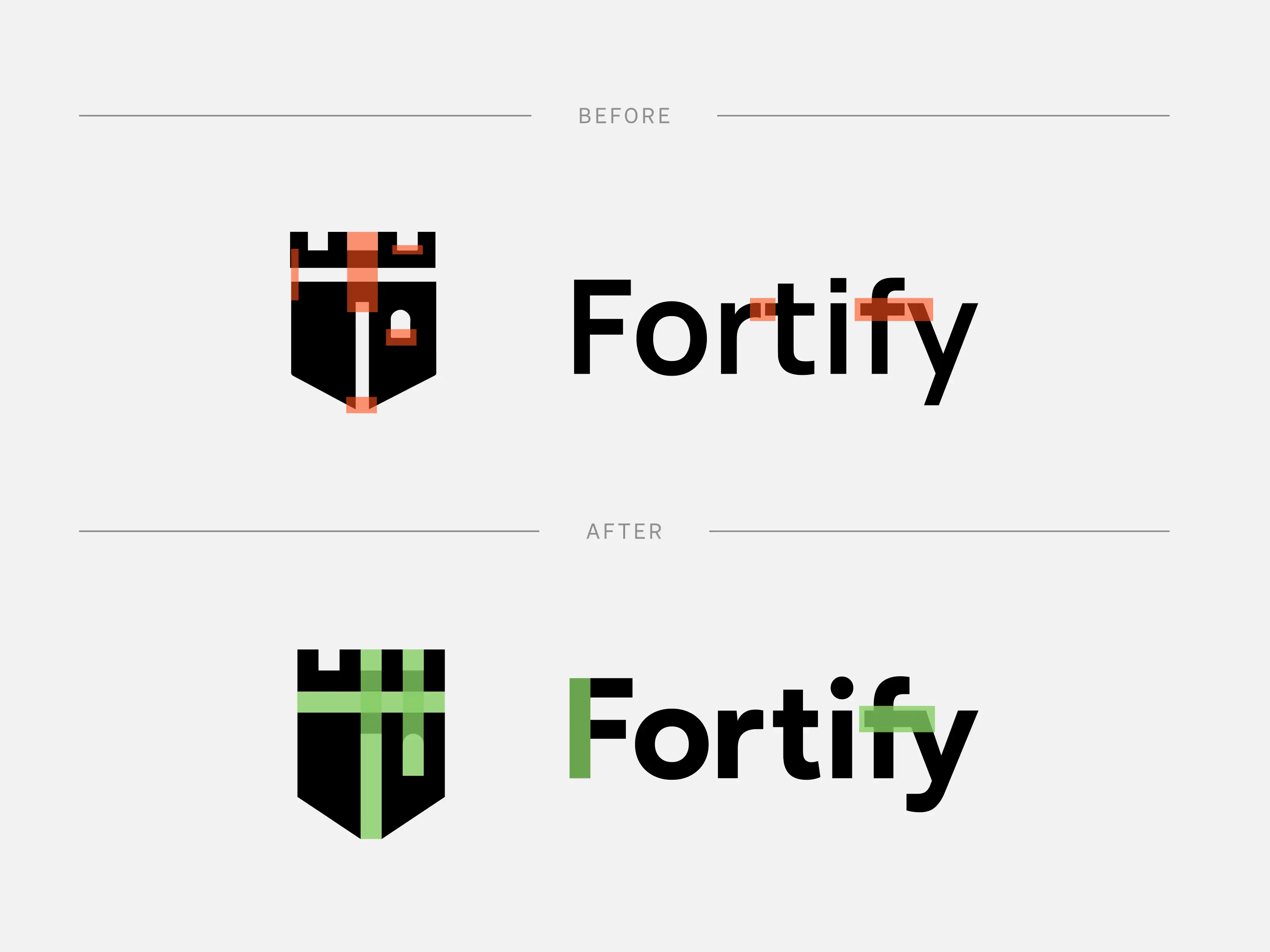
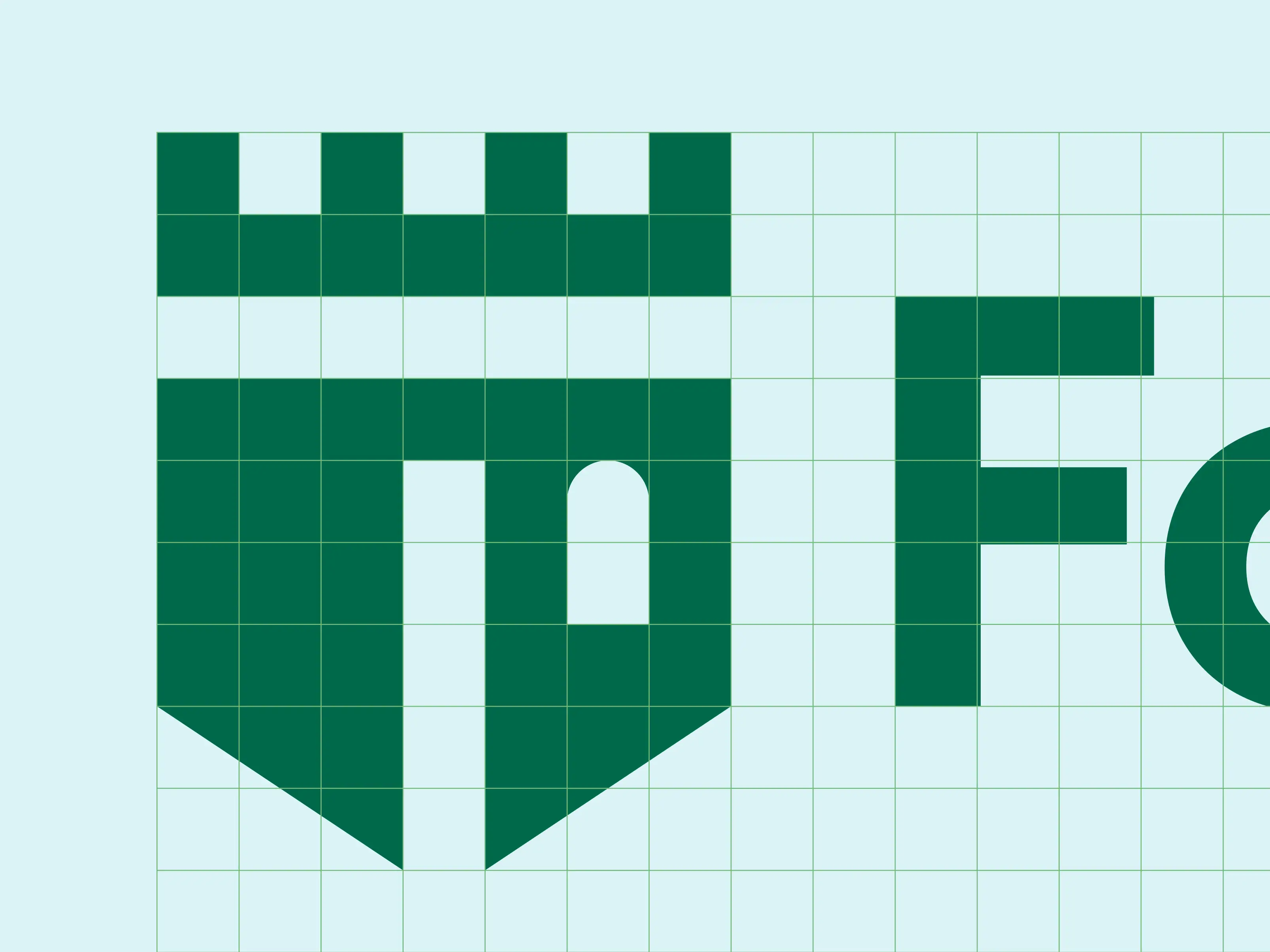
We refined Fortify’s logo by reworking its structure and alignment to create a more precise and confident mark. Paired with updated typography, the logotype now better complements the geometric logomark. A modern, subdued color palette was introduced to align with the professional tone of school administrators and financial decision-makers.
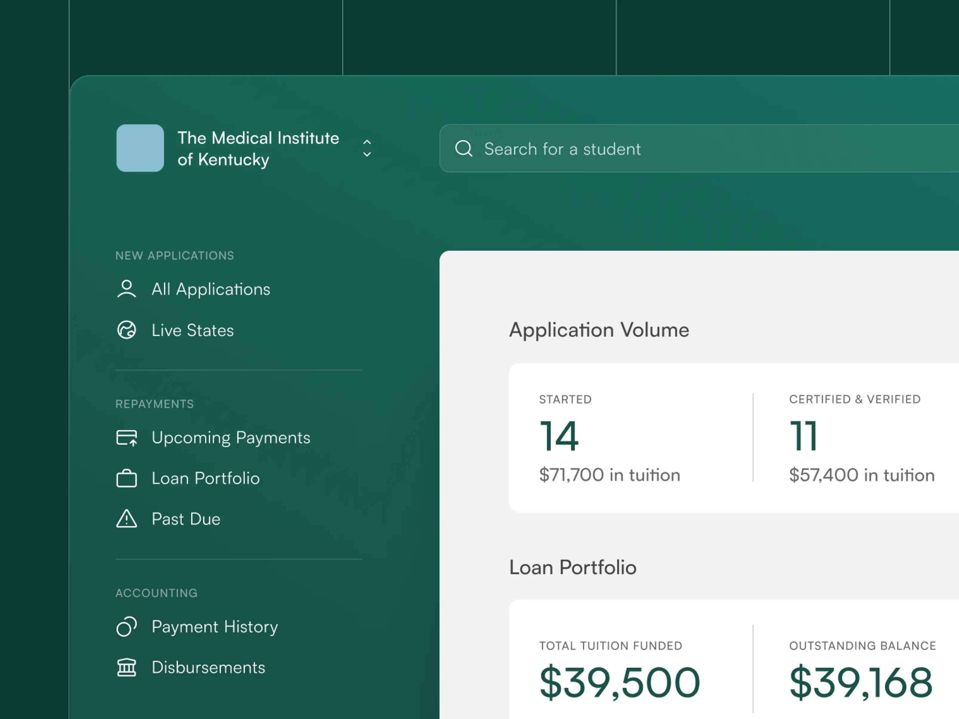
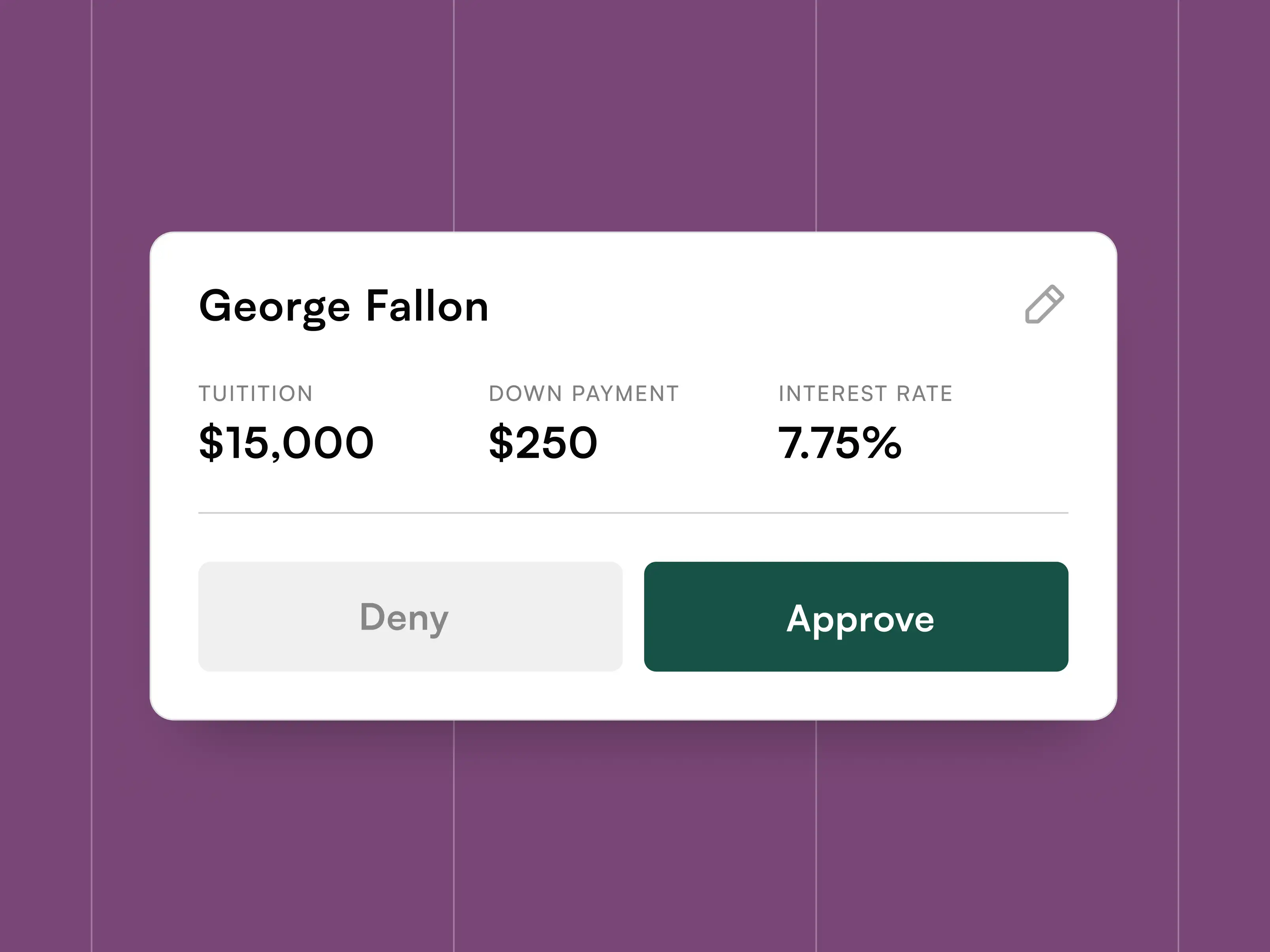
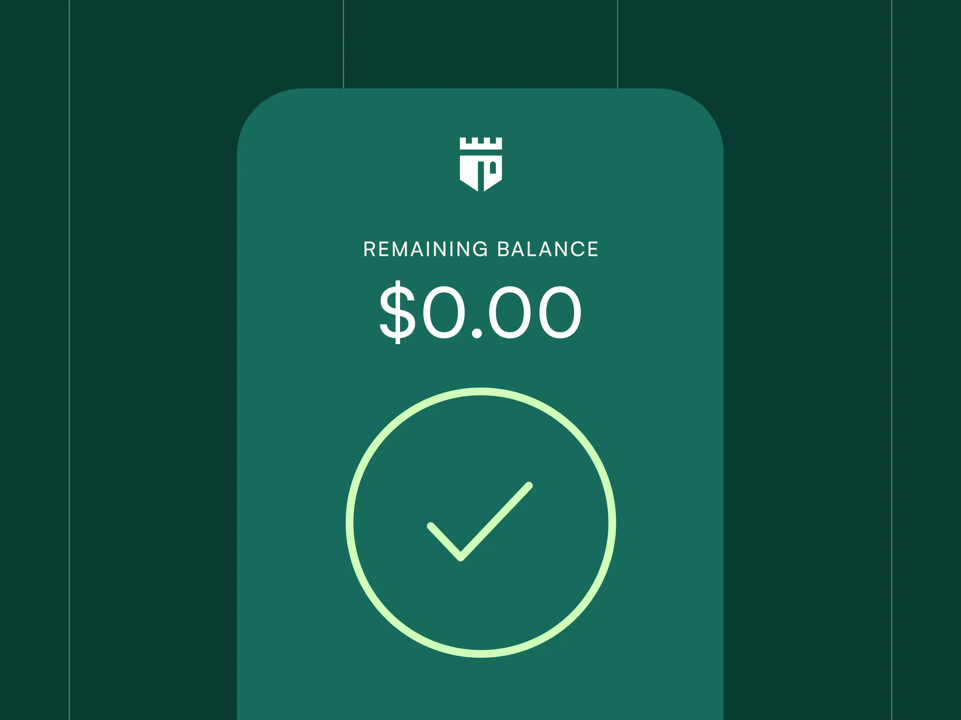
The existing dashboard lacked visual consistency and clarity. We introduced a tighter spacing system, clearer text hierarchy, and new UI elements to elevate the experience. The result: a cleaner, more intuitive interface that feels polished and reliable.
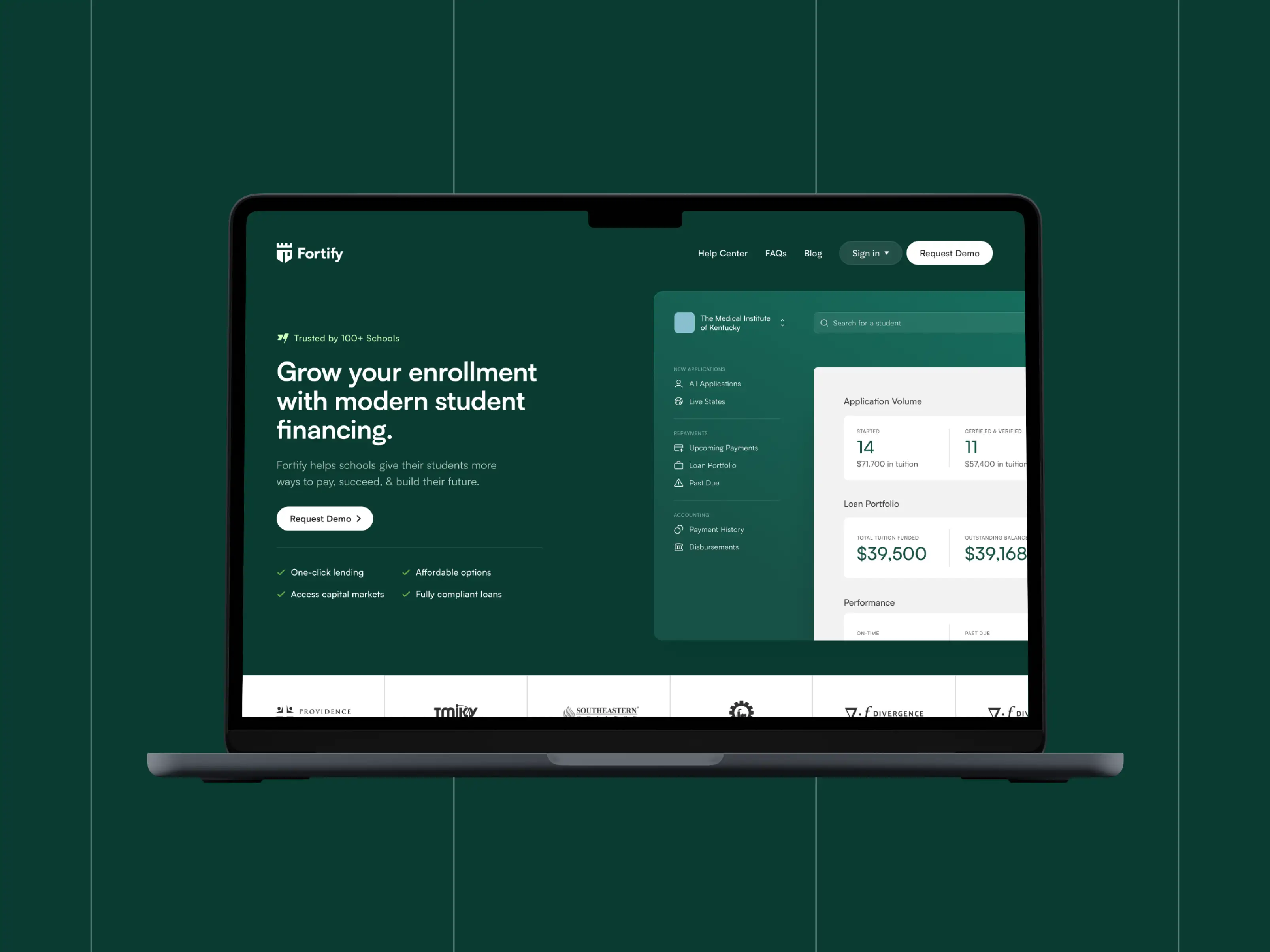
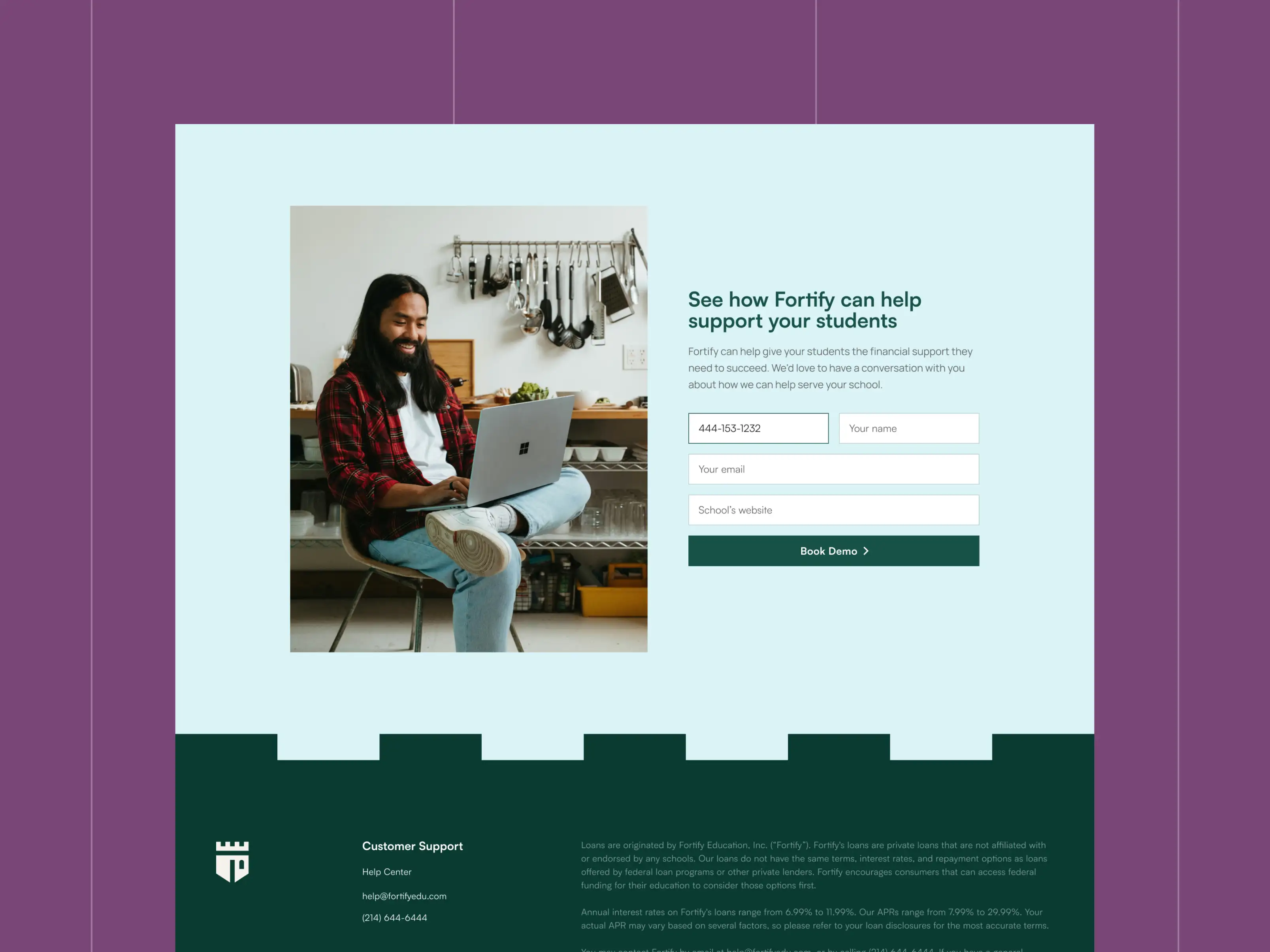
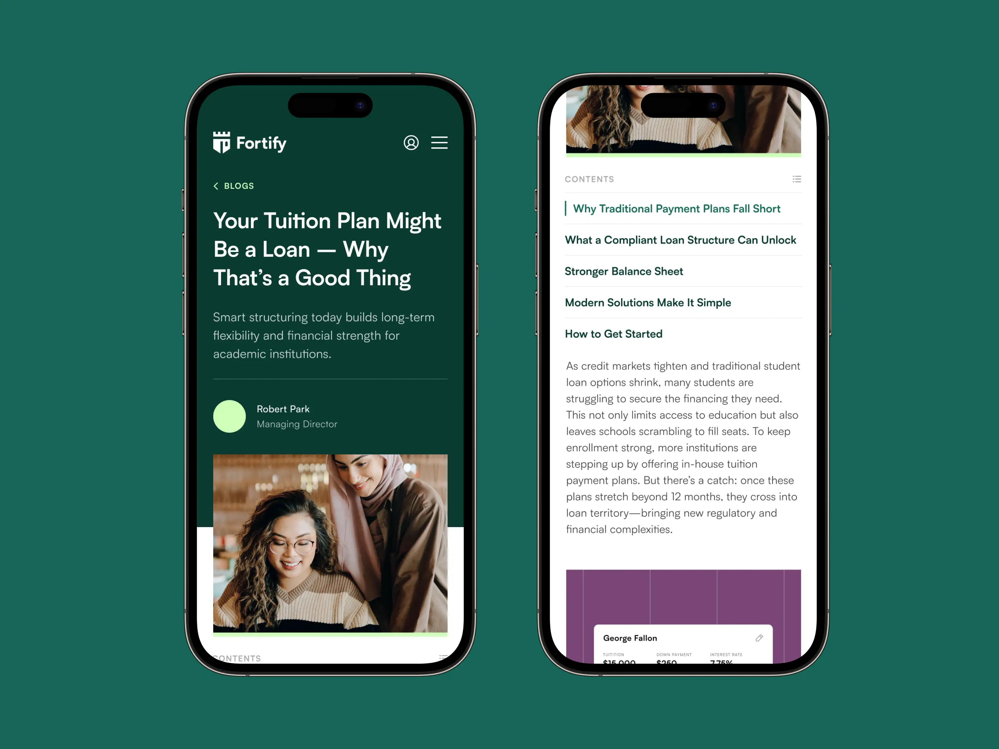
We reimagined the website from the ground up to reflect Fortify’s updated brand. Subtle nods to the name—like sharp corner radii and brick-inspired patterns—add structure and continuity throughout the site. We designed flexible page templates that support rich storytelling, including dynamic article and case study layouts optimized for readability and long-form content.


Pennymac